UI Animation for Apps: 7 UX Microinteractions That Boost Engagement
I watched someone use a perfectly “functional” app the other day and it was… oddly painful. Not because it crashed. Not because the design was ugly. It was worse than that.
They tapped a button and nothing happened. So they tapped again. Then again. Then the screen finally changed and—surprise—three actions fired at once. They looked at me like I’d built them a booby trap.
That’s the thing with UI animation. When it’s missing, you feel it in your bones. When it’s done well, you don’t notice it—you just feel like the app “gets you”. And if you’re building an app for your business (or trying to rescue one that’s already out in the wild), a handful of small UX microinteractions can do more for engagement than another round of feature creep.
I’m not talking about making your app dance. I’m talking about tiny moments of feedback that stop users guessing, reduce errors, and make the interface feel responsive. Simple. Quick. Relevant. Like good manners.
Microinteractions: the small stuff users remember
If you’ve ever used an app and felt weirdly calm—like you always knew what was happening—that wasn’t luck. That was someone sweating the details. Probably at 11:47pm. Possibly with a cold cup of tea.
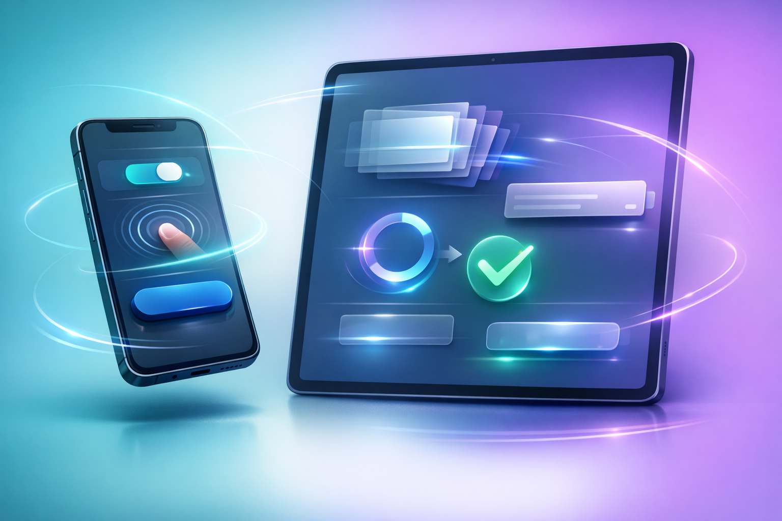
Microinteractions are those little responses: a button press, a loading state, a swipe, a toggle. UI animation for apps makes them legible. It answers the user’s constant silent questions: “Did that work?” “Where did it go?” “Is it still loading?”
Below are seven microinteractions I keep coming back to. Not because they’re trendy. Because they fix real problems I’ve watched real humans have.
1) Button press feedback that’s immediate (and subtle)
A tap without feedback is basically the app shrugging. The simplest win: when someone presses a button, make it respond instantly—scale down a touch, change colour slightly, add a soft ripple, something.
The key is speed. If the animation starts late, it feels like lag. If it’s too dramatic, it feels like a toy. I usually aim for a quick press state around 80–120ms, then return smoothly.
Also—this is a boring detail that matters—make sure the pressed state is visible even on bright screens outdoors. “Subtle” shouldn’t mean “invisible”.
2) Loading states that show progress (or at least intention)
Spinners are fine. Spinners are also the UI equivalent of “please hold”. Sometimes that’s all you can do. But if your app can show what it’s doing, users relax.
A skeleton screen (those grey placeholder blocks that resemble the layout) is one of my favourite UX microinteractions. It says: “Content is coming, and it will look like this.” That’s oddly comforting.
If you can show real progress—percentages, steps, a timeline—great. If you can’t, at least animate the placeholder gently so it feels alive, not frozen. And please don’t block the whole screen unless you truly have to.
3) Transitions that explain where things went
Ever tap into a product, then hit back and feel like you’ve been teleported? That’s a transition problem.
Good UI animation connects screens so the user understands the relationship between them. A card expands into a detail view. A photo zooms into a gallery. A sheet slides up from the bottom because that’s where it “lives”.
This isn’t about fancy motion paths. It’s about spatial logic. If you can help users keep their mental map, they make fewer mistakes and feel more in control. And yes, they stick around longer.
4) Swipe gestures with resistance and “snap”
Gestures are brilliant until they’re mysterious. If your app uses swipes (to delete, archive, reveal actions), the motion needs to teach the user what’s possible.
Add a little resistance at the edge. Let the item follow the finger. Reveal the action underneath as it moves. Then, when the threshold is crossed, snap it into place with a quick, confident finish.
One thing I’ve learned the hard way: if the swipe threshold is too sensitive, users delete things accidentally and never forgive you. If it’s too stubborn, they think the feature is broken. Test it with someone who isn’t in your team. They’ll humble you quickly.
5) Form validation that doesn’t scold
Forms are where good vibes go to die. But animation can make them… not awful.
When there’s an error, don’t just dump red text at the top like a teacher marking homework. Highlight the field, animate the focus to it, and explain what to fix in plain language. A gentle shake can work, but keep it subtle—nobody wants their email field having a tantrum.
Even better: validate as the user types, but only when it’s helpful. If you shout “Invalid email!” after they type “e”, you’re not being helpful—you’re being clingy.
6) Confirmation moments that reduce anxiety
People hesitate right after they do something important: send a message, place an order, submit a booking, delete a file. They’re thinking, “Did it go through?”
This is where a small confirmation animation earns its keep. A button morphs into a tick. A toast message slides in and fades out. A subtle haptic bump (if you’re on mobile) says “yep, done”.
If the action is irreversible, add a tiny undo window. Not a huge modal that blocks everything—just a calm, temporary option. It’s a microinteraction that quietly builds trust, and trust is basically the real engagement metric.
7) Empty states that feel intentional (not forgotten)
Empty states are unavoidable. New users have no data. Search results sometimes come up blank. A calendar might have nothing booked. If the screen looks dead, users assume the app is dead.
A good empty state uses a bit of motion to feel intentional: a gentle illustration loop, a pulsing placeholder, a small nudge that says what to do next. Not a full cartoon show—just enough life to signal, “This is normal.”
And please, for the love of all that is usable, don’t blame the user: “You have no favourites yet.” Cool. They’ve been here twelve seconds. Give them a path forward.
How to make UI animation feel good (without overdoing it)
I’ve seen teams sprinkle animation everywhere like it’s parmesan. It’s tempting. Motion is fun. But too much UI animation for apps makes people feel delayed, distracted, even a bit seasick.
Here are the checks I run through before shipping anything:
- Keep it quick. Most microinteractions should resolve in under 300ms. Longer is fine for deliberate transitions, but make it earn the time.
- Make it purposeful. If the animation doesn’t answer a user question—“what happened?” “where am I?”—it’s probably decoration.
- Use easing like a human would move. Linear motion feels robotic. Ease-out for things that settle. Ease-in for things that start.
- Respect accessibility. Support reduced motion settings. Some users genuinely can’t tolerate big movement, and they shouldn’t be punished for it.
- Be consistent. If one panel slides up and another fades in, users start learning the wrong lessons. Reuse patterns.
One more: performance is part of the experience. A gorgeous animation at 20fps isn’t gorgeous. It’s a stutter. If you’re choosing between fancy motion and smooth motion, pick smooth every time and don’t feel bad about it.
A practical way to add microinteractions without a full redesign
If you’re improving an existing app, you don’t need to rebuild the whole UI to get the benefits of animation. I’d start by watching five people use the app—properly watching, not “explaining” while they use it (I’ve been guilty).
Make a list of moments where they hesitate, repeat an action, or ask “did it work?” Those are your microinteraction hotspots. Add feedback there first. Button presses. Loading states. Confirmations. The boring bits.
Then measure something simple: fewer repeated taps, fewer abandoned forms, fewer support messages like “I can’t tell if it saved”. Engagement often rises as a side effect of clarity.
And if you’re building a new app for your business, bake this thinking in early. It’s much easier to design motion alongside the interface than to glue it on later like an afterthought.
The weird truth is that users don’t fall in love with features. They fall in love with feeling competent. UI animation, when it’s done with restraint, helps them feel that. Like the app is paying attention.
Which, honestly, is all any of us really want—from software, from people, from the world… a little sign that what we did mattered.